

 For website professionals, saving time on website builds and mockups is a must to stay competitive and profitable. One way to satisfy this business need is to use CSS grid templates and CSS grid template areas.
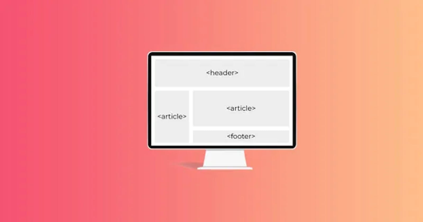
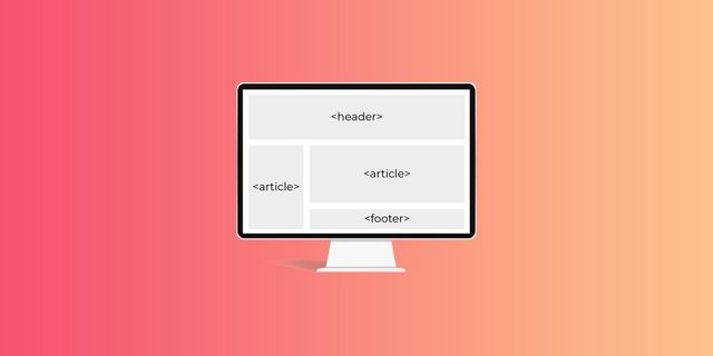
Many modern websites are built using grids, which divide a page into major regions and define the relationship between elements in terms of size, position, and layer. Grids make it easy to place elements into both columns and rows.
CSS GRID TEMPLATE AREA BASICS
A CSS grid template area makes a visual representation of the grid using both columns and rows. This makes for a faster design process than when line-based placement or grid-column and grid-row values are used.
Why?
Using line-based placement isn’t as streamlined as grid template areas. And, as UI/UX Designer & Front-End Developer Ahmad Shadeed points out, when you change one element in grid-column, like the width of the sidebar span, you also have to individually change the width of the footer, main element, and other elements.
With a CSS grid template area, you set the width in a single command and then the placements of the grid cells — and everything adjusts accordingly.
Another benefit to CSS grid template areas: they are responsive.
HOW TO USE CSS GRID TEMPLATE AREAS
To reap the time saving benefits of designing with this method, build a CSS grid template and name your CSS grid template areas in two CSS coding steps. Common grid template areas to specify include header, menu, footer, sidebar, main content, etc. Once these are set up, they’re easy to move around within your grid template.
First, define names of your grid template areas with the grid-area property. This sets up the next step, which will create the grid-template layout.
For instance, below is an example from Mozilla that sets the grid areas with shortcuts for header, footer, content, and sidebar.
.header {
grid-area: hd;
}
.footer {
grid-area: ft;
}
.content {
grid-area: main;
}
.sidebar {
grid-area: sd;
}
Second, use grid-template areas property to define how the areas appear in the rows and columns. This creates your easy-to-use webpage template.
For instance, in the example below from Mozilla, the first line command sets the display as a grid. In the next line command, the columns are defined as “9” items long. In the next line command, the rows are set. Then, the CSS grid template areas are given their arrangements.
wrapper {
display: grid;

grid-template-columns: repeat(9, 1fr);

grid-auto-rows: minmax(100px, auto);

grid-template-areas:

  "hd hd hd hd   hd   hd   hd   hd   hd"

  "sd sd sd main main main main main main"

  "ft ft ft ft   ft   ft   ft   ft   ft";
}
As you see in the code above, you need to use the grid-template areas (names of your content areas) multiple times to add up to the number of columns in your grid template. The header “hd” above gets all nine widths in the column. In the next row, the sidebar as defined as “sb” in the code above gets three widths in the column, and the main content gets six widths of the column. In the third row, the footer gets all nine column widths.
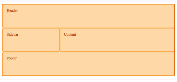
Here is the HTML that follows the CSS. The HTML populates the grid template with the actual content.
<div class="sidebar">Sidebar</div>

<div class="content">Content</div>

<div class="footer">Footer</div>
And here is the result:
 UNDERSTANDING THE CODE
You can use the shorthand CSS fraction code (fr), meaning fraction of the free space. The fraction command eliminates overflow on the x-axis even when you set a grid-column-gap value. With the fraction command, when, as in the above example, you set each column to “1fr,” the grid accounts for the grid-column-gap value and subtracts it from the total width for each column.
You can also use the shorthand repeat code like above to make the columns repeat. For example, “grid-template-columns:repeat (9, 1fr);” shows the combined commands that specify the fraction code and the number of columns. For 6 columns or 12 columns or 15 columns, you would change the value after it repeats.
You also can easily control other ways the grid template appears.
For instance:
You can set the grid-gap. You can set a background color. You can set padding. Here’s another example, which uses the “container” command instead of the “wrapper” command.
.item-1 {
grid-area: head;
}
.item-2 {
grid-area: main;
}
.item-3 {
grid-area: side;
}
.item-4 {
grid-area: footer;
}
.container {
display: grid;
grid-template-columns: 2fr 2fr 1fr 2fr;
grid-template-rows: 100px 200px 100px;
grid-template-areas:
"head head . side"

"main main . side"

"footer footer footer footer";
}
When the HTML with the actual content (not included in the above code) is added to this CSS grid template, it will result in:
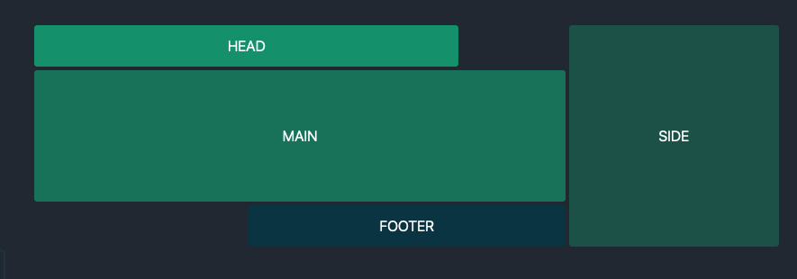 The only code that changed were where the spaces (using dots) land in the template — see below:
.container {
/ ... /
grid-template-areas:
"head head  .    side"

"main main main  side"

". footer footer side";
/ ... /
}
SUBSCRIBE TO YOUTUBE CHANNEL